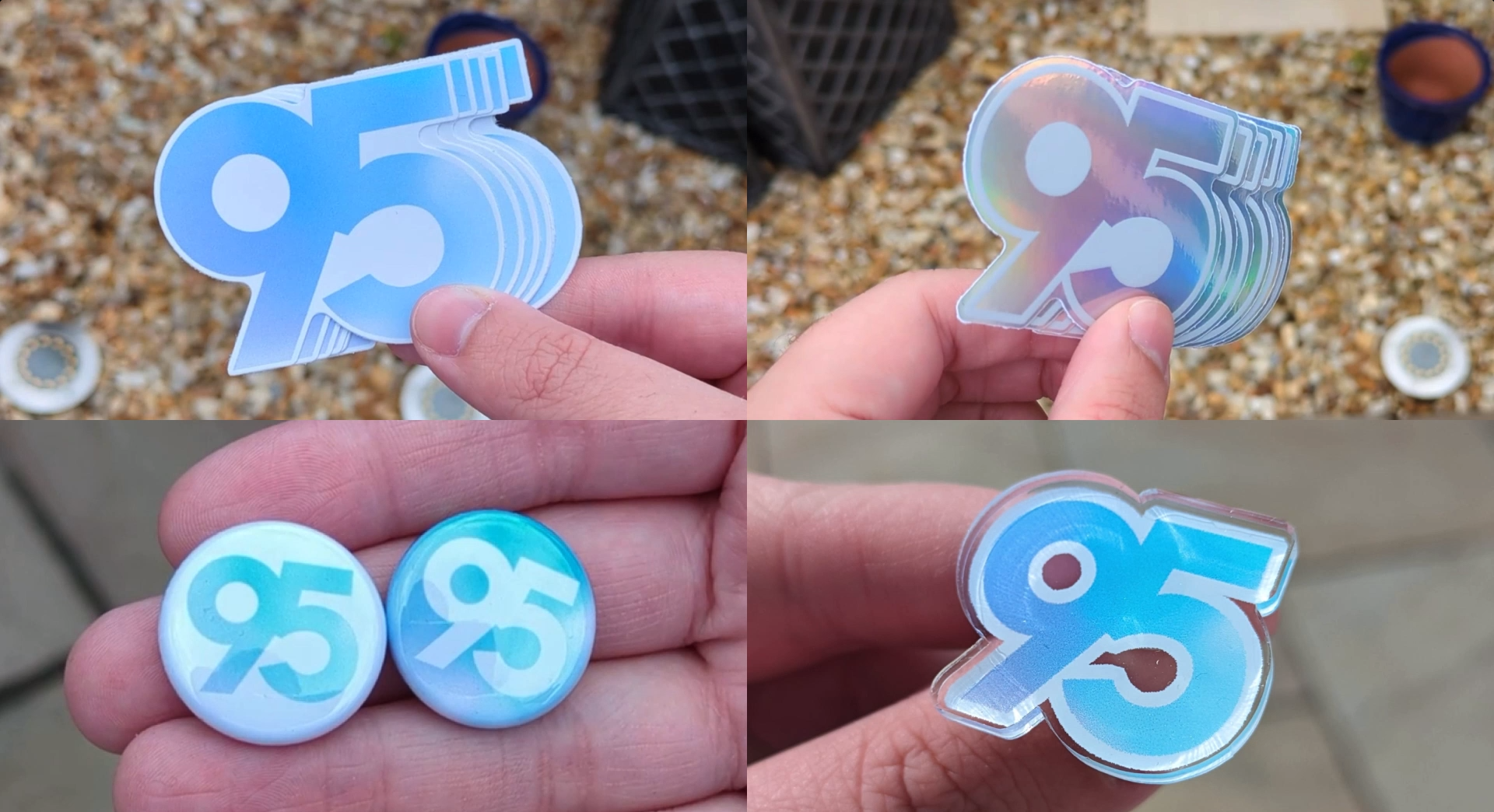
All the way back in 2021, we refreshed every aspect of the 95 Degrees branding to a colourful blue gradient, with the idea that it would be more vibrant and clear.
Putting it clearly, we regret it. Really - it was a total mistake. I failed to understand the ongoing trends of UI design, graphic design and colour science - less is more, and minimalism is the clear, simple way forward. Looking back, all those white, blue, purple and green gradients clashed way too much.
Fortunately, starting today, we’re going back to our roots, to the longest-standing colour scheme in our history - black and white, as seen in our v2 and v3 branding eras.
On top of that, we have removed the word “degrees” from our branding entirely - we haven’t been using the cafe theme for years. Originally, we wanted to use the cafe theme - but from now on, as some of us already do, we will be calling the community simply “95”.
Lastly, and most importantly, our logo has changed - two arcs resembling a 9 and a 5, showcasing every angle of our community - or if you look at them from a 90-degree angle, they appear as bridges, representing the connections we help create between people around the world.
So, we’re really excited about this change. Lots of work was put into this project, and we hope it has been worth it. Obviously, you’ll see the “95” arcs rolling out across our icons, banners and pages soon. Life is full of surprises - go ahead and read the first letter of each sentence.


